Thursday, 24 November 2011

Horizon

Working within supplied design guidelines I have to design and introductory section and cover to complete my zine.


Here is on of those less unsuccessful thumbnails that I decided t take further and produce a digital version of it.

Here I tried to manipulate with heading 'Hello and Welcome'
The idea was to position the ampersand behind 'welcome' in a way so that the top curve would align with 'hello' and the curve would replace 'O'. However when I started to do that in In-design it did not look as good as on the thumbnail. It turned out to be 'hell and welcome'.
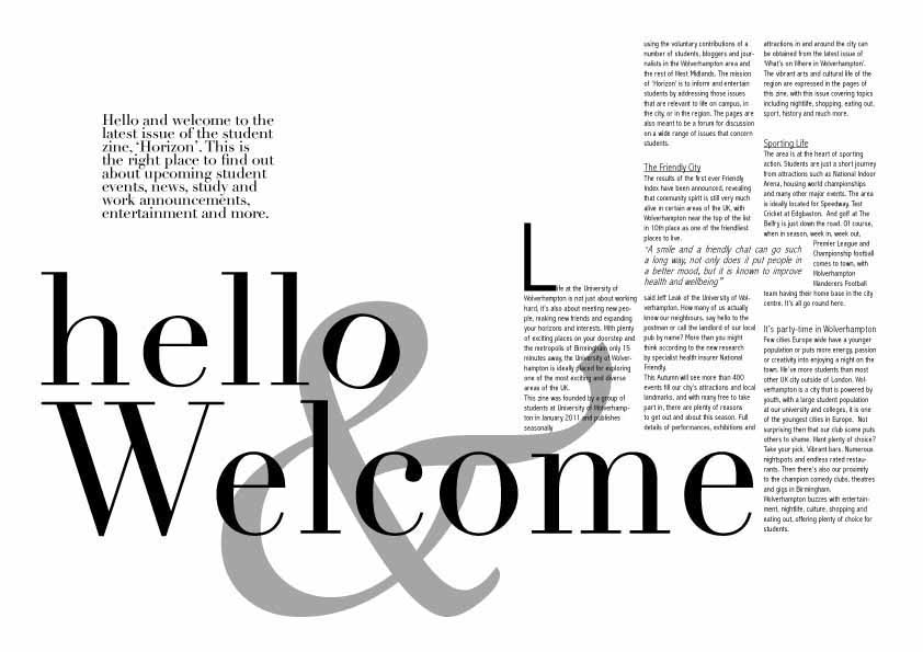

 
So I added that poor 'O' but it still didn't look balanced so I decided to put it in an angle so that it matches the angle of that curve and doesn't really stand out of the overall composition.

(cover is still to come)

"À bout de souffle" (Breathlesss) by Jean-Luc Godard 1960


Seated in an uncomfortable seat spent an hour of my life watching a masterpiece, one of the great movies ever made. Did not know what to expect because have never seen a movie of Jean-Luc Godard and thought that I’ll give it a shot only because it was directed by one of the most influential directors of ALL-TIME even though I am not a great fan of that era.

To be honest I found the film monotonous, unentertaining and boring, but it still is one of the greatest movies. I think being black and white and dull story line in the film left me emotion-less, I understand the intrigue, particularly if you were alive and young when this film was showing for the first time in the cinema but it didn’t hit me the way it did others. However I can appreciate how it influenced and affected everybody down the generations and it still was directed by one of the greatest of all time.  I like movies when after watching you have to get yourself thinking and constantly get back to it and rethink over again and "Breathless" was not one of them, but it still is one of the greatest movies ever made.

Wednesday, 2 November 2011

Tuesday, 1 November 2011

Clever Typography

Researching about typography have come across some very interesting pieces for some might be design inspiration. There are gathered 40 Creative Typography Logos created by talented designers. Those logos include wordmark and lettermark logo designs as well as some pictorial logos that have used typography innovatively.

It shows how the clever use of typography and characters can be when used in conjunction with white, negative, positive spacing, colors and accents to create a logo that effectively communicates to the world your business’ personality, identity, essence and individuality.

http://speckyboy.com/2011/05/11/40-creative-logos-with-clever-typography/

Some of my favorites:

ANT


3EE


 BLANK


 DOWNTOWN


SEVEN SPARROWS


 LOOK


 UP

Moscow Pin Map

Continuing cartography subject.....  

My interest in maps stems from a love of landscape. I've always enjoyed crowds and events that bring people together. For me maps are interesting for many different reasons; they can be interesting just to look at, to study and understand or learn things, to collect or create oneself and each of those has parts which are interesting on their own
 
Inspired by the inherent beauty and simplicity of lines and forms that arise from natural topography and build environment. And as a native Russian speaker and lover of maps and big cities I have produced my own version of Moscow's map.
Materials: Panel pins and cotton thread.
Size: A0


Tuesday, 25 October 2011

W'hampton Art Gallery Visit

Jan Mikulka “Jakub”

I thought it is a photograph but when I had stepped closer realized it’s not.
It is so incredibly life-like it caught my imagination with its minutely detailed and skilful rendering of skin and hair tones and very effective and I would even say powerful lightning.I don’t think I have ever seen such a stunningly amazing use of light in a portrait. I was completely blown away by it. It gave me an impression that portrait was lit up and if I stepped forward the portrait then I would be able to see much more details that I could not see because of the light and shadow falling on Jakub’s face. Because of the effective lightning I had a desire to push Jakub backwards to the shadow or pull him towards to the light to see his face clearer.
I was also touched by the slightly sulky expression, which makes him look very young.

Saturday, 8 October 2011

The Black Cat

Had to read a famous short story "The Black Cat" by not less famous Edgar Allan Poe.It was first printed on August 19, 1843, in the Philadelphia edition of a newspaper called the United States Saturday Post.

I think this story is rather disturbing. Poe says that he is not mad yet how could he not be, he kills his wife and shows no shame! I think perhaps he was insane.
I also think that Pluto, the Black Cat, was a metaphor for Poe's drinking problem it
shows us how someone can change for the worse due to drinking.He was obsessed with the cat being the beast but he turned into a beast himself...
But at the same time this could be not about alcoholism but instead it shows the way in which the narrator avoids taking responsibility for anything he does, instead blaming it on the alcohol and the cat.

For lazy readers, can listen or download an audiobook here.